A2 Media Studies
Friday, 3 April 2015
Thursday, 2 April 2015
Wednesday, 1 April 2015
Monday, 23 March 2015
Evaluation question 4 - How did I use media technology in the proess of making my music video
These are some of the websites that I remember sing throughout my course, although I have used more, I've just forgotten the names of some:
•www.youtube.com
•www.blogger.com
•www.google.com
•www.facebook.com
•www.prezi.com
•www.wyke.ac.uk
•www.twitter.com
•www.goanimate.com
•www.dafont.com
This is a link to a video analysis of more of my technologies used in the construction of my media products
Everio Camcorder -- In this video I talk about how and when I used the camcorder. I talk about settings used, where I used it and also why I used it ad then chose not to use it.
Tripods -- In this video I will be talking about the tripods used hen creating my products
Evaluation question 3 - What have you learned from your audience feedback?
I have prepared a survey which I am hoping will give me a wide range of result to help me in improving my music advert poster
https://www.surveymonkey.com/s/9NMKWVQ
Although I only got a small amount of replies from my questionnaire (4 responses), they were helpful for me. these were the results from the people that reviewed it.
As you can see the results given are varied, there is a low, medium and a high rating. The advice given to me was understandable and helpful. The improvements given were as followed:
- A better quality image needed for the main image
- Add more colour
- loosen up the shapes to make them less boxy
- The ratings down the side of the page
- The way I've done Eddies name
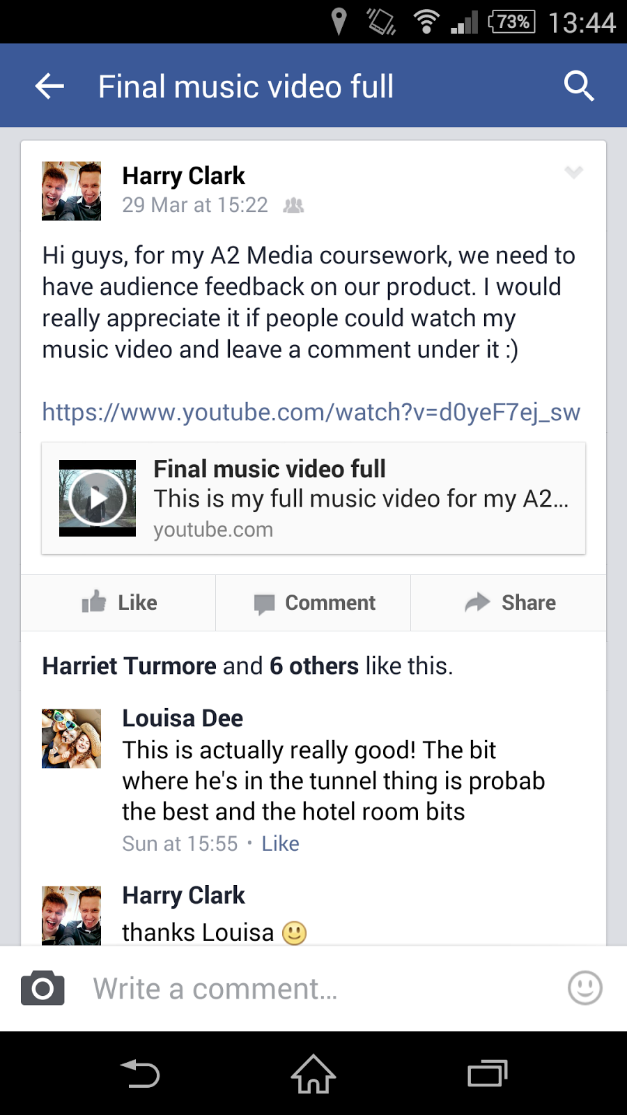
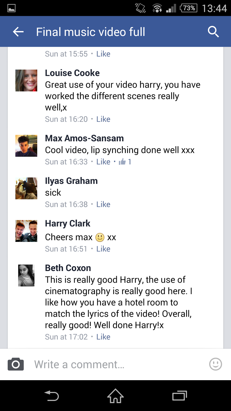
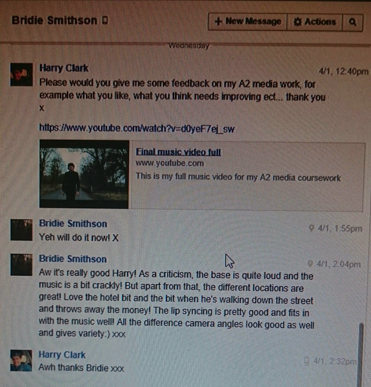
- Lip sync was in time and correct
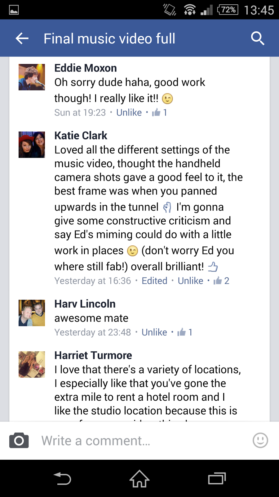
- Multiple locations
- Use of props e.g. guitar
- The creativity in booking a hotel room for the video
- Concentration on all the locations at the end of the video
- My use of cinematography with the different shots used
- Use of the tracker and pan shots going vertically and horizontally
- Including a female to the video for a bit of the narrative
- Spinning of the record player (using imagery to match the lyrics)
- Use of the studio as it is a performance video
By using Facebook I was not only reaching out to my friends
but I was also reaching out to those I didn't know, those who were told about
the video by others, this was good as well, this increased my audience range
and also increased the amount of feedback I got back. The ability to connect
with others on social media nowadays is hugely increasing with the amount of
networks opening up every week.


With these results off of my friends, I was able to change
anything needing to be changed in order to fulfil my target audience, this is
also why I used Facebook as a source of feedback, my friends on Facebook are
the target audience that would be trying to aim for in the world. Although
there was a very high amount of positive feedback there was some negative. I
could have looked upon this feedback in a bad way but took it as
constructive criticism and I was able to make vital changes to my products. The
main negative that people pointed out was that the music sound quality wasn't
very good, I tired many times to try to correct this but I was not able to.


Evaluation question 1 - In what ways does your media product use, develop or challenge forms and conventions of real media products?
My media products include; media music
video, music advert for a magazine and a CD 6-sided Digi pack
Conventions used within my music video
This is a selection of locations where Pharrell appeared in his video 'Happy':
Although there are a lot more locations that Pharrell used, I tried to follow what he has done and use many locations rather than only a few. Within my audience feedback a lot of people had commented on that that they liked the numerous locations, they liked not knowing where he would be next and that it kept the video 'alive' in some was a they didn't get bored of looking at the same 2/3 places.
Although I did think of many other places that I could of used and that would of been very helpful, I was limited to the choice of locations I could get to, for example, me and Eddie would have to get there, this would mean money, and transport to getting o the locations. This could of increased my grade of my video but I wasn't able to get to any other better locations I used what I had and put the nearby locations to full use.
•Also like most music videos, my shots changed with the beat of the song in most cases, this was another likeable feature from my audience feedback. Because it changed with the beat of the song, there were very few shots lasting more than 5 seconds. I did this to not let the viewer get bored or too use to the same location.
Conventions used within my music poster
Conventions used within my CD Digi Pack
Conventions used within my music video
•I
have many conventions of a normal music video, for example, when I was
researching different videos for inspiration on my own video, I found features
which I would know I’d use in mine. Pharrell Williams’ song ‘Happy’ used a
feature which I used within my own. Within the song there is the same artist
singing the song in a varied amount of locations. There are a large number of
locations which are all different to one another, I used my knowledge of the
local area to find 6/7 locations which are all different to each other, this
mixed up my video and within the audience feedback proved to be a good choice
as a lot of responses showed that they liked the varied amount of locations.
This is a selection of my locations where my artist featured:This is a selection of locations where Pharrell appeared in his video 'Happy':
Although there are a lot more locations that Pharrell used, I tried to follow what he has done and use many locations rather than only a few. Within my audience feedback a lot of people had commented on that that they liked the numerous locations, they liked not knowing where he would be next and that it kept the video 'alive' in some was a they didn't get bored of looking at the same 2/3 places.
Although I did think of many other places that I could of used and that would of been very helpful, I was limited to the choice of locations I could get to, for example, me and Eddie would have to get there, this would mean money, and transport to getting o the locations. This could of increased my grade of my video but I wasn't able to get to any other better locations I used what I had and put the nearby locations to full use.
•Also like most music videos, my shots changed with the beat of the song in most cases, this was another likeable feature from my audience feedback. Because it changed with the beat of the song, there were very few shots lasting more than 5 seconds. I did this to not let the viewer get bored or too use to the same location.
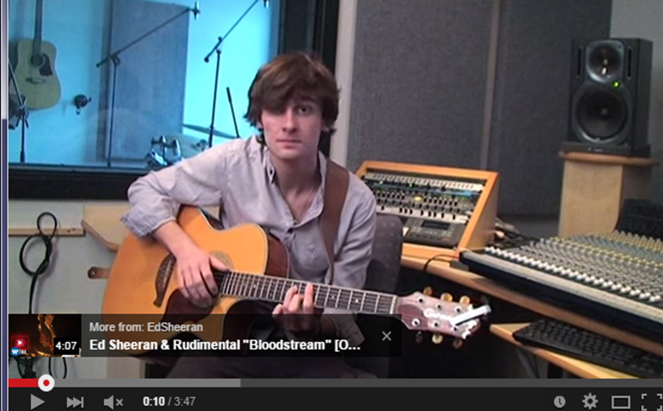
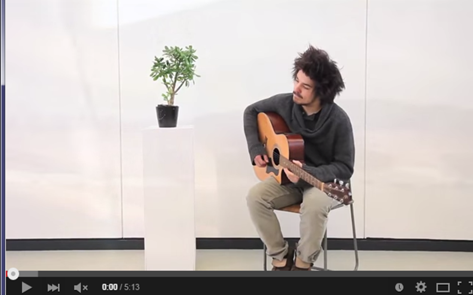
•In
addition to both of these conventions, I used one more specific feature from a
music video. At the start of ‘Stolen Dance’ by Milky chance, he is sat there
with the start of the song playing and he is holding a guitar (like Eddie was
in mine) and is motionless until the guitar tune comes in and then he starts
playing (like Eddie did in mine)
Using conventions of other videos when using the tracker. Within the music video 'Happy' by Pharrell Williams, there are numerous tracking shots of people singing the song, I took some of these conventions and applied to my own video. for example, at 1:12-1:15 in the song, there is a tracking shot of Pharrell and I used this same shot in my own video with Eddie in the hotel. In my video it is shown at 2:49-2:54
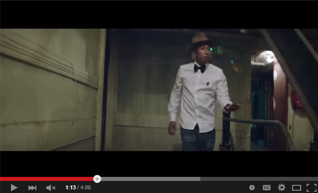


Using conventions of other videos when using the tracker. Within the music video 'Happy' by Pharrell Williams, there are numerous tracking shots of people singing the song, I took some of these conventions and applied to my own video. for example, at 1:12-1:15 in the song, there is a tracking shot of Pharrell and I used this same shot in my own video with Eddie in the hotel. In my video it is shown at 2:49-2:54

Conventions used within my music poster
•When
looking at my music poster which is set to be a music magazine advert, you can
see certain conventions I have used which you would see on normal adverts. For
example the use of the ‘5 Stars’ comment and also other artist and magazine
comments. This is a convention used by music industries when producing adverts,
the reason this is used is to persuade your audience into buying the advert and
by showing comments made by artists, magazines, website etc. you can show that
your product is already widely known by sometimes the ‘big brands’ of the
industry.
•The
ITunes, Spotify and HMV logo are there to show the audience the availability of
the product and where it can be found, this is used on practically all other
music adverts.
•Also,
because my audience is mainly 18-25yr olds, I have put a QR code on the advert
cover, this is because it is rare to find someone these days without a phone or
device with a camera, usually most phones now are touch screen and are adapted
to carry apps. With this you can get a QR code scanner app which allows you to
scan these codes and you are then taken to a website, game, store etc. I would
have my QR code go to the official website of my artist.
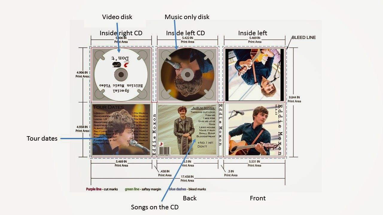
Conventions used within my CD Digi Pack
•On
the front of my Digi
pack, I have the obvious convention of using an image of the artist and the
name of the artist, as simple as it is, many CD pack do this too, it is an easy
way of simply showing the viewer of the pack who it is.
•The
back of the CD pack couldn’t be more stereotypical to look at, although it is
very conventional with the barcode and song list, I think it looks good as it
is what you would expect to see.
•The
first inside slit of the Digi pack is a list of tour dates to look at, I put the
tour dates there because you will always see them when you open up the pack, I
didn’t put them in the left of the pack on the inside because of the simple
fact that it can be easily avoided when taking out the cd you want, therefore I
put it on the inside cover when you open it out.
•My
CD’s are relatively easy to explain, the first one is just a picture of Eddie
on the cd which you would sometimes expect to see and the second cd, the one
that has the purpose of showing the video, is labelled ‘music video’.

Subscribe to:
Comments (Atom)


